
Introduction to Data Handling
Data handling means to collect and present the data so that it could be used in further studies and to find some results.
Data
Any information collected in the form of numbers, words, measurements, symbols, or in any other form is called data.
Graphical Representation of Data
The grouped data can be represented graphically for its clear picture and it is the easiest way to understand the data.
1. Pictograph
When we represent the data through pictures or symbols then it is called Pictograph.

Here one tree represents 10 trees. And we can easily read the pictograph.
The graph shows that there are 30 trees of apple and so on.
2. Bar Graphs
In the bar graph, the information represented by the bars of the same width with equal gaps but the height of the bars represents the respective values.

Here, the names of pets are represented on the horizontal line and the values of the respective pets are shown by the height of the bars. There is an equal gap between each bar.
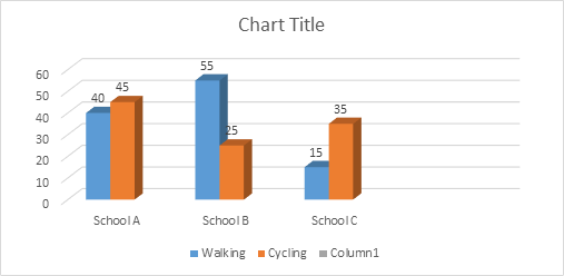
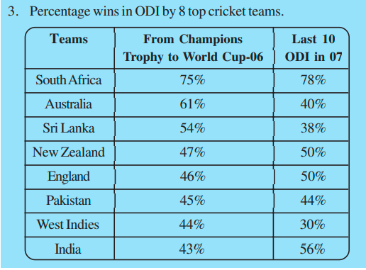
3. Double Bar Graph
To compare some data, we can use the double bar graph as it shows the information of two quantities simultaneously.

Here, in the above graph, it represents the marks of the students in two different tests altogether. So we can compare the marks easily.

Organizing Data
Any data which is available in the unorganized form is called Raw Data.
This raw data is arranged or grouped in a systematic manner to make it meaningful which is called the Presentation of Data.
Terms Related to Data Organizing
1. Frequency
Frequency tells us the no. of times a particular quantity repeats itself.
2. Frequency Distribution Table
Frequency can be represented by the frequency distribution table.

The above table shows the no. of times a particular colour repeat in the bag of skittles.
Frequency can also be shown by the tally marks. A cut over four lines represents the number 5.


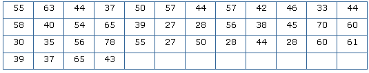
1. Grouping Data
If we have a large number of quantities, then we need to group the observation and then make the table. Such a table is called a Grouped Frequency Distribution Table.
Some Important terms related to grouped Frequency Distribution Table
- Class Interval or Class: When all the observations are classified in several groups according to their size then these groups are called Class Interval
- Lower-class Limit: The lowest number in every class interval is known as its Lower-class Limit.
- Upper-class Limit: The highest number in every class interval is known as its Upper-class Limit.
- Width or Size or Magnitude of the Class Interval: The difference between the upper-class limit and the lower class limit is called the Size of the Class Interval.
Example
There is a list of marks of 40 students in a school. Arrange this in grouped frequency distribution table.
Solution
As we can see that the lowest number in the above data is 27 and the highest number is 78, so we can make intervals if 20 – 30, 30 – 40 so on.
Remark: As number 30 comes in two class interval but we cannot count it in both the intervals. So it is to remember that the common observation will always be counted in the higher class. Hence 30 will come in 30-40, not in 20-30.
Histogram
Basically, the bar graph of the grouped frequency distribution or continuous class interval is called Histogram.
The class intervals are shown on the horizontal line and the frequency of the class interval is shown as the height of the bars.
There is no gap between each bar.
Example
Draw a histogram for the wages of 30 workers in a company. The wages are as follows: 830, 840, 868, 890, 806, 840, 835, 890,840, 885, 835, 835, 836, 878, 810, 835, 836, 869, 845, 855, 845, 804, 808, 860, 832, 833, 812, 898, 890, 820.
Solution
Make the grouped frequency distribution of the given data.
| Class Interval | Frequency |
|---|---|
| 800 – 810 | 3 |
| 810 – 820 | 2 |
| 820 – 830 | 1 |
| 830 – 840 | 9 |
| 840 – 850 | 5 |
| 850 – 860 | 1 |
| 860 – 870 | 3 |
| 870 – 880 | 1 |
| 880 – 890 | 1 |
| 890 – 900 | 4 |
Draw the histogram by taking the class interval on the horizontal line and the frequency on the vertical line.
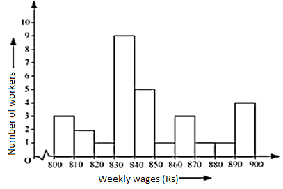
Remark: As the class interval does not start from zero, so we will put a jagged line which shows that there is no number between 0 – 800.
Circle Graph or Pie Chart
If we represent the data in a circle form then it is said to be a pie chart. This graph shows the relationship between the whole and its part. We have to divide the circle into sectors and each sector is proportional to its respective activity.
We use it when we have information on percentage or fraction.
Drawing of a Pie Chart
If we have the information in percentage then we need to calculate the respective angles to show them in the pie chart.
As we know that a complete circle is of 360°, so we need to calculate the fraction of 360° for every sector.
Example
Draw a pie chart of the following percentage of genres of movies liked by the public.
| Genres of Movie | Percentage of the no. of people |
|---|---|
| Comedy | 27% |
| Action | 18% |
| Romance | 14% |
| Drama | 14% |
| Horror | 11% |
| Foreign | 8% |
| Science fiction | 8% |
Solution
To draw the pie chart first we need to calculate the angle by taking the fraction of 360°.
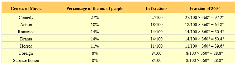
By using these angles draw a pie chart.

Exercise 3.1
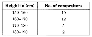
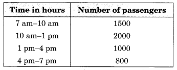
- For which of these would you use a histogram to show the data?
(i) The number of letters for different areas in a postman’s bag.
(ii) The height of competitors in an athletics meet.
(iii) The number of cassettes produced by 5 companies.
(iv) The number of passengers boarding trains from 7 a.m to 7 p.m at a station.
Give a reason for each.
Solution:
(i) The number of areas cannot be represented in class-intervals. So, we cannot use the histogram to show the data.
(ii) Height of competitors can be divided into intervals. So, we can use histogram here.
For example:
(iii) Companies cannot be divided into intervals. So, we cannot use histogram here.
(iv) Time for boarding the train can be divided into intervals. So, we can use histogram here.
For example:
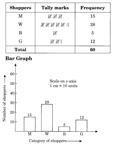
2. The shoppers who come to a departmental store are marked as: man (M), woman (W), boy (B) or girl (G). The following list gives the shoppers who came during the first hour in the morning.
W W W G B W W M G G M M W W W W
G B M W B G G M W W M M W W W
M W B W G M W W W W G W M M W
W M W G W M G W M M B G G W
Make a frequency distribution table using tally marks. Draw a bar graph to illustrate it.
Solution:
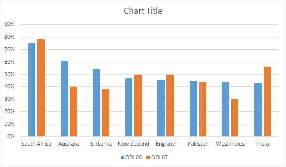
3. The weekly wages (in ₹) of 30 workers in a factory are:
830, 835, 890, 810, 835, 836, 869, 845, 898, 890,
820, 860, 832, 833, 855, 845, 804, 808, 812, 840,
885, 835, 835, 836, 878, 840, 868, 890, 806, 840
Using tally marks make a frequency table with intervals as 800-810, 810-820 and so on.
Solution:


4. Draw a histogram for the frequency table made for the data in Question 3, and answer the following questions:
(i) Which group has the maximum number of workers?
(ii) How many workers earn ₹ 850 and more?
(iii) How many workers earn less than ₹ 850?
Solution:
Refer to the frequency table of Question No. 3.
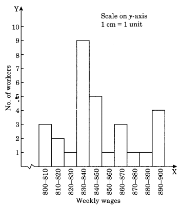
(I) Group 830-840 has the maximum number of workers, i.e., 9.
(ii) 10 workers earn equal and more than ₹ 850.
(iii) 20 workers earn less than ₹ 850.
5. The number of hours for which students of a particular class watched television during holidays is shown through the given graph.
Answer the following questions.
(i) For how many hours did the maximum number of students watch TV?
(ii) How many students watched TV for less than 4 hours?
(iii) How many students spent more than 5 hours watching TV?
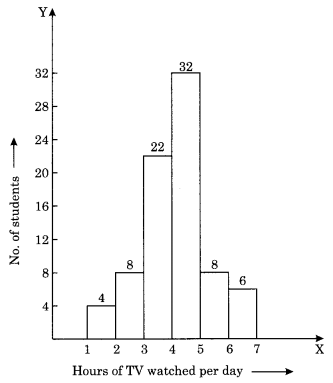
Solution:
(i) 32 is the maximum number of students who watched TV for 4 to 5 hours.
(ii) 4 + 8 + 22 = 34 students watched TV for less than 4 hours.
(iii) 8 + 6 = 14 students watched TV for more than 5 hours.
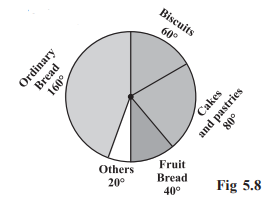
Example 2:
On a particular day, the sales (in rupees) of different items of a baker’s shop are given below.
ordinary bread : 320
fruit bread : 80
cakes and pastries : 160
biscuits : 120
others : 40
Total : 720
Draw a pie chart for this data.
Solution:
We find the central angle of each sector. Here the total sale = ` 720. We thus have this table
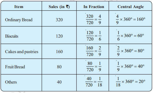
Now, we make the pie chart (Fig 5.8):
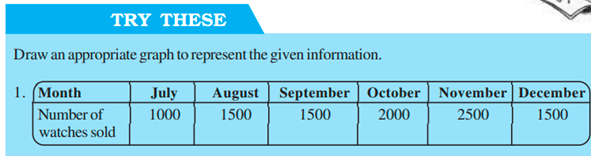
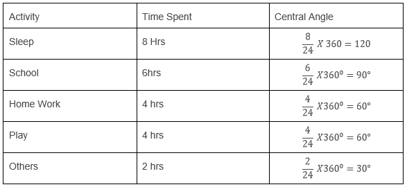
TRY THESE
Draw a pie chart of the data given below.
The time spent by a child during a day.
Sleep — 8 hours
School — 6 hours
Home work — 4 hours
Play — 4 hours
Others — 2 hours
Total hours spent =24

Exercise 5.2
- A survey was made to find the type of music that a certain group of young people liked in a city. The adjoining pie chart shows the findings of this survey

From this pie chart answer the following:
(i) If 20 people liked classical music, how many young people were surveyed?
(ii) Which type of music is liked by the maximum number of people?
(iii) If a cassette company were to make 1000 CDs. How many of each type would they make?
Solution:
(i) Number of young people who were surveyed = 100×20/10 = 200 people.
(ii) Light music is liked by the maximum people, i.e., 40%
(iii) Total number of CD = 1000
Number of viewers who like classical music = 10×1000/100 = 100
Number of viewer who like semi-classical music = 20×1000/100 = 200
Number of viewers who like light music = 40×1000/100 = 400
Number of viewers who like folk music = 30×1000/100 = 300
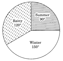
2. A group of 360 people were asked to vote for their favourite season from the three seasons rainy, winter and summer.

(i) Which season got the most votes?
(ii) Find the central angle of each sector.
(iii) Draw a pie chart to show this information.
Solution:
(i) Winter season got the most votes, i.e. 150
(ii)
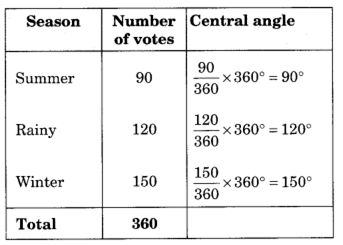
(iii)Pie chart
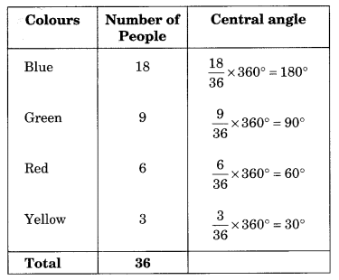
3. Draw a pie chart showing the following information. The table shows the colours preferred by a group of people.
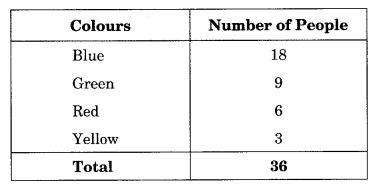
Solution:
Table to find the central angle of each sector

4. The following pie chart gives the marks scored in an examination by a student in Hindi, English, Mathematics, Social Science and Science. If the total marks obtained by the students were 540, answer the following questions.

i) In which subject did the student score 105 marks?
(Hint: for 540 marks, the central angle = 360°. So, for 105 marks, what is the central angle?)
(ii) How many more marks were obtained by the student in Mathematics than in Hindi?
(iii) Examine whether the sum of the marks obtained in Social Science and Mathematics is more than that in Science and Hindi.
(Hint: Just study the central angles).
Solution:

(I) For 540 marks, the central angle = 360°
For 105 marks the central angle = 360/540×105 = 70°
Corresponding subject = Hindi
(ii) Marks obtained in Mathematics = 90/360×540 = 135
Marks obtained in Mathematics more than Hindi = 135 – 105 = 30
(iii) Central angle of Social Science + Mathematics = 65° + 90° = 155°
Central angle of Science + Hindi = 80° + 70° = 150°
5. Marks obtained in Social Science and Mathematics are more than that of the marks obtained in Science and Hindi.
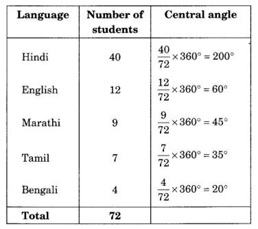
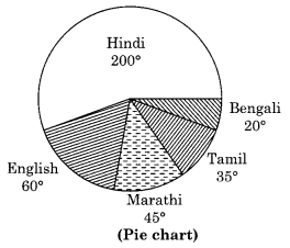
The number of students in a hostel, speaking different languages is given below. Display the data in a pie chart.
| Language | Number of students |
|---|---|
| Hindi | 40 |
| English | 12 |
| Marathi | 9 |
| Tamil | 7 |
| Bengali | 4 |
| Total | 72 |
Solution:
Chance and Probability
Probability tells the degree of uncertainty. It measures the likelihood that an event will occur.
Random Experiment
If the result of the experiment is not known then it is known as a random experiment.
Example
If we throw a dice, then the result could be any number from 1 – 6.

Outcomes
When we do an experiment then there could be different results, these possible results of the random experiment are called outcomes.
Example
There are two possible outcomes when we toss a coin i.e. head and tail.
Equally Likely Outcomes
If every outcome has the same possibility of occurring these outcomes are called Equally Likely Outcomes.
Example
If we throw a dice, then there is an equal chance of every no. to come while doing the random experiment. i.e. a dice has the same possibility of getting 1, 2, 3, 4, 5 and 6.
Linking Chances to the Probability

Example
What is the chance of getting 3 when we throw a dice?
Solution
There is only one chance to get 3 in one throw and the total possible outcomes are 6.
Hence the probability of getting =1/6.
Outcomes as Events
Each outcome or collection of outcomes of an experiment is known as an event.

Example
If we throw a dice then getting each outcome 1, 2, 3, 4, 5, and 6 are events.
Example
What is the event of getting odd numbers when we throw a dice?
Solution
The probability of getting an odd number is 3(odd numbers are 1, 3, 5)
The total number of outcomes is 6.
The probability of getting an odd number = 3/6.
Example
What is the probability of spinning yellow?

Here number of chances to come yellow while spinning is 3.
The total number of outcomes is 8.

Exercise 3.3
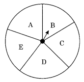
- List the outcomes you can see in these experiments.
(i) Spinning a wheel
(ii) Tossing two coins together
Solution:
(i) On spinning the wheel, we can get the following outcomes B, C, D, E and A.
(ii) When two coins are tossed together, we get the following outcomes
HH, HT, TH, TT (Where H denotes Head and T denotes Tail)
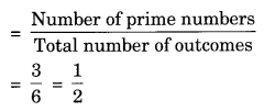
2. When a die is thrown, list the outcomes of an event of getting
(i) (a) a prime number
(b) not a prime number
(ii) (a) a number greater than 5
(b) a number not greater than 5
Solution:
(i) (a) The prime number are 2, 3 and 5
Required outcomes = 2, 3 and 5
(b) Outcomes for not a prime number are 1, 4 and 6
Required outcomes = 1, 4, 6.
(ii) (a) Outcomes for a number greater than 5 = 6
Required outcome = 6
(b) Outcomes for a number not greater than 5 are 1, 2, 3, 4, 5
Required outcomes = 1, 2, 3, 4, 5.
3. Find the
(i) Probability of the pointer stopping on D in (Question 1-(a))?
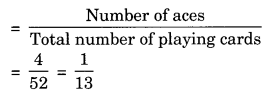
(ii) Probability of getting an ace from a well-shuffled deck of 52 playing cards?
(iii) Probability of getting a red apple, (see figure below)

Solution:
(i) Refer to fig. Question 1-(a)
Total number of sectors = 5
Number of sector where the pointer stops = 1, i.e. D
Probability of pointer stopping at D = 15
(ii) Number of aces = 4 (one from each suit i.e. heart, diamond, club and spade)
Total number of playing cards = 52
Probability of getting an ace
(iii) Total number of apples = 7
Number of red apples = 4
Probability of getting red apples

4. Numbers 1 to 10 are written on ten separate slips (one number on one slip), kept in a box, and mixed well. One slip is chosen from the box without looking into it. What is the probability of:
(i) getting a number 6?
(ii) getting a number less than 6?
(iii) getting a number greater than 6?
(iv) getting a 1-digit number?
Solution:
(i) Probability of getting a number 6 = 110
(ii) Probability of getting a number less than 6 = 510 = 12 [∵ Numbers less than 6 are 1, 2, 3, 4, 5]
(iii) Probability of getting a number greater than 6 = 410 = 25 [∵ Number greater than 6 are 7, 8, 9, 10]
(iv) Probability of getting a 1-digit number = 910
[∵ 1-digit numbers are 9, i.e. 1, 2, 3, 4, 5, 6, 7, 8, 9]
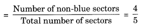
5. If you have a spinning wheel with 3 green sectors, 1 blue sector and 1 red sector, what is the probability of getting a green sector? What is the probability of getting a non-blue sector?
Solution:
Total number of sectors are = 3 green + 1 blue + 1 red = 5 sectors
Probability of getting a green sector

Number of non-blue sectors are = 3 green + 1 red = 4 sectors
Probability of getting non-blue sector
6. Find the probabilities of the events given in Question 2.
Solution:
Refer to Question 2, we have
(i) (a) Probability of getting a prime number
(b) Probability of getting a non-prime number

(ii) (a) Probability of getting a number greater than 5 = 1/6
(b) Probability of a number not greater than 5 = or, 1 – 1/6= 5/6